We set out to create a simple and frictionless customer experience for Vodafone to help increase sales and improve overall customer outcomes.
Challenge
In order to help the client achieve this, we needed to embed the customer into every aspect of the program and ensure that the customer needs remained front of mind in everything that we did. With many moving parts to consider, and a project constructed using hybrid agile methodology, we needed to ensure that the team of 50+ multidisciplinary resources were aligned and understood what each stream required to be successful.
This was a huge tech lead project, so we had to work within many technical constraints, including Vlocity (Salesforce) and AEM. The Agile Waterfall methodology, paired with an intense pace of delivery, made it difficult in terms of collaborating and communicating at all times with each of the teams.
Approach
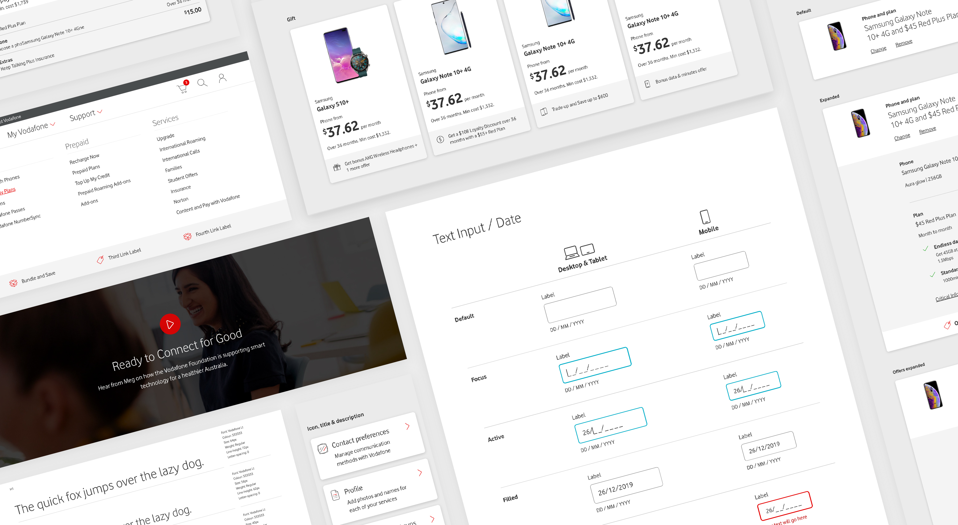
Vodafone Australia initially asked us to take the current state components and uplift them with the new branding from Vodafone UK's design system. However, we pushed to change some things for a better and more tailored user experience. I was given the responsibility of overseeing and building out Vodafone Australia’s new design system using InVision’s Design System Manager (DSM), ensuring that new or revised components were added to the design system in every sprint alongside delivering new features.
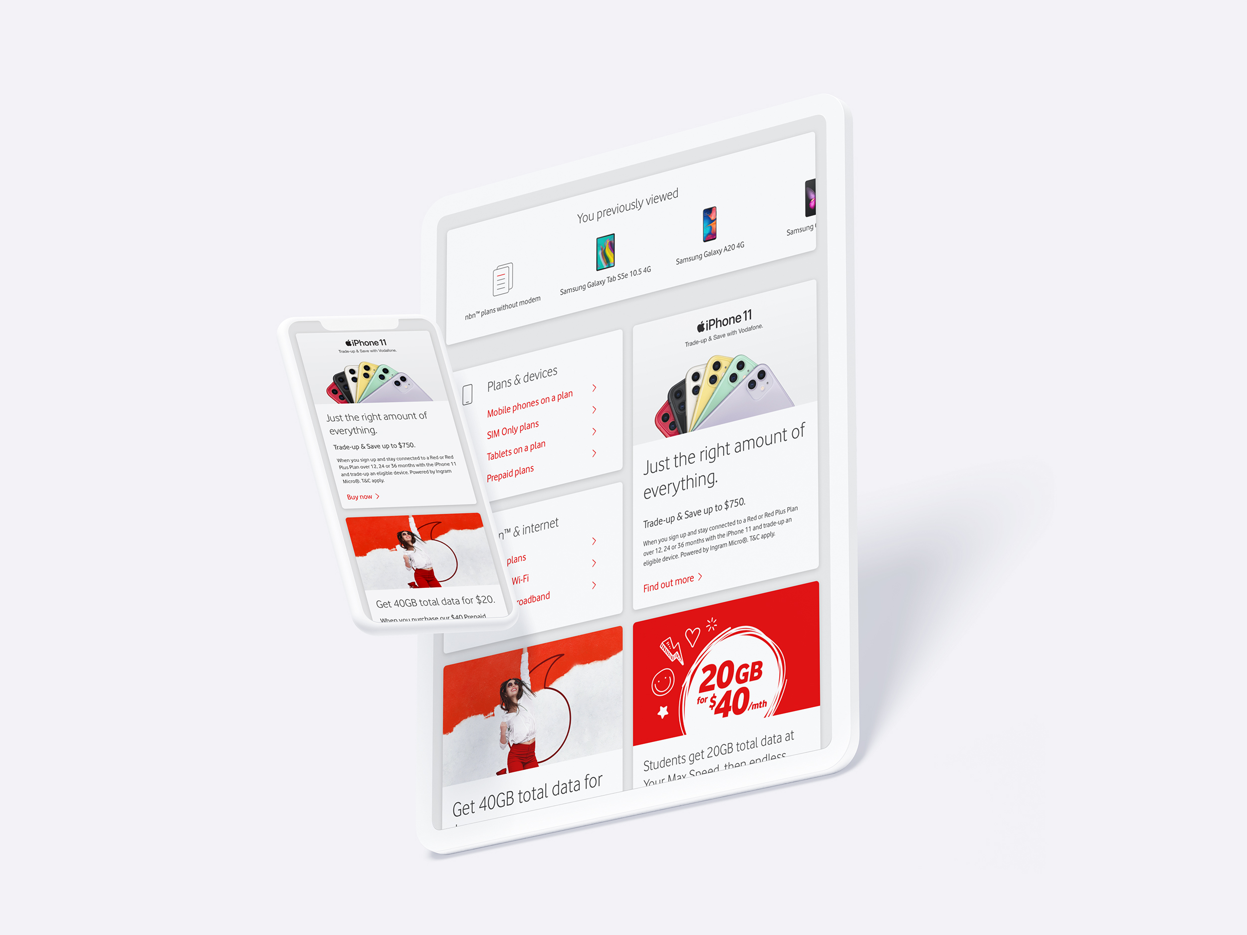
We used the UK design system as our base to construct templates. Where appropriate, we broke the UK design system patterns to create unique AU components, as some had limited functionality or a less ideal interface compared to what we needed to achieve. We had access to a Vodafone image library in addition to the Vodafone Brand Guidelines, and worked hard with their brand team to push the Vodafone brand presence throughout the designs, especially on the home page.
We had weekly showcases of in-flight designs which I helped to facilitate and present to a variety of client stakeholders. We came prepared with best practice research to back up any proposed changes and presented our ideal design solutions where we had flexibility to do so. We also continued to push for better collaboration between resources and got involved in user testing wherever possible.
Technical constraints were a huge roadblock that we had to work around, especially due to the nature of how Vlocity is built which presented many restrictions, even for some of the simplest interactions. Ongoing communication with the Vlocity, AEM and FED teams was critical to ensure we explored and understood the options we had available and where we had scope to push these limitations.
Result
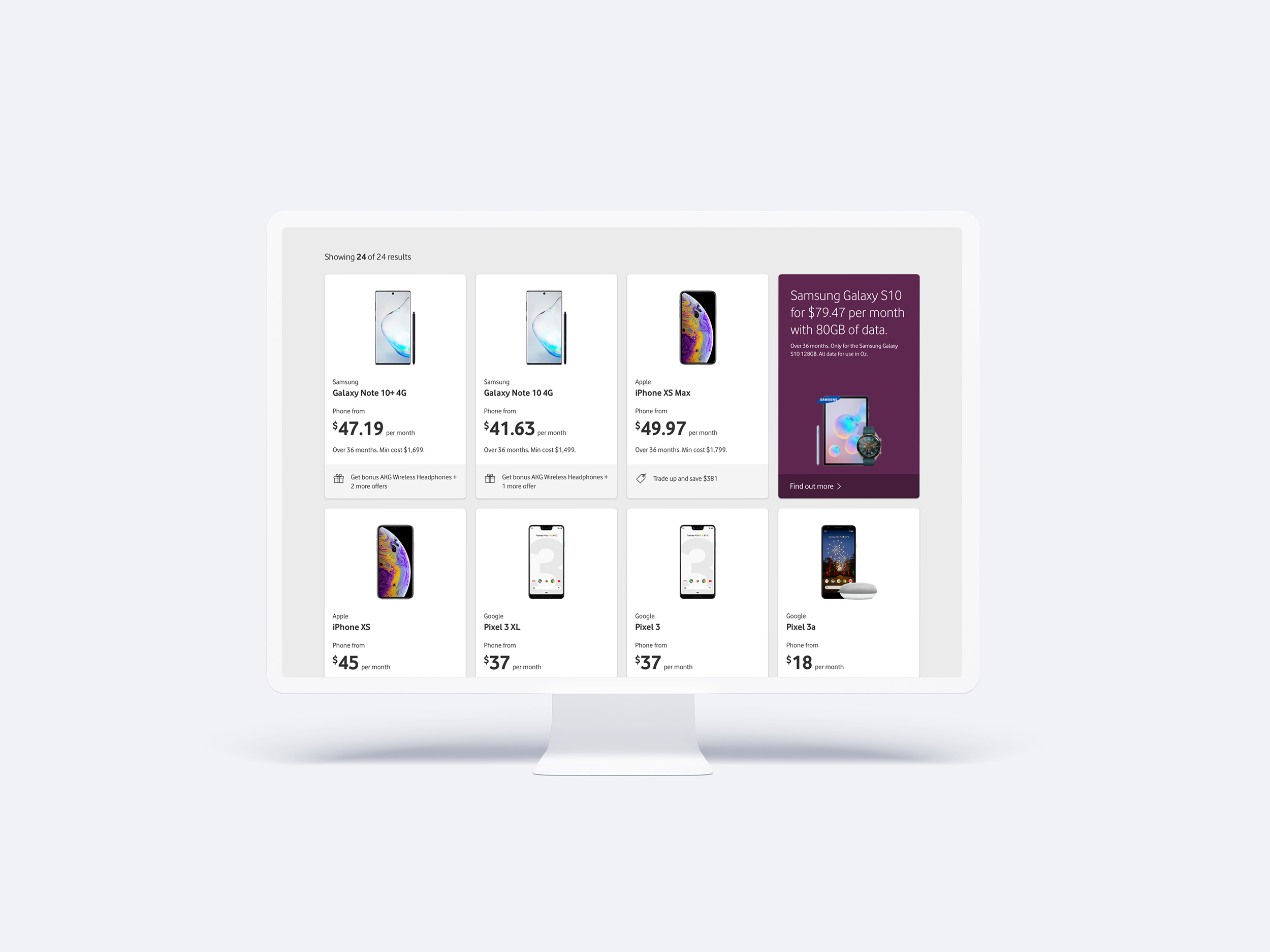
What began as several metre–long user journey maps, polished designs were embedded into user flows and prototypes covering 20+ user journeys and 20+ templates, a pattern library and design system was established using InVision DSM with 60+ types of components, supported by an extensive amount of written documentation that included key design decisions, UI specifications, global and usage rules, motion, styles, image guidelines and more.
The new customer interface provides the basis for signification uplift in customer satisfaction and key sales metrics. The project also embedded customer experience design capability and processes into the client’s digital delivery organisation.


