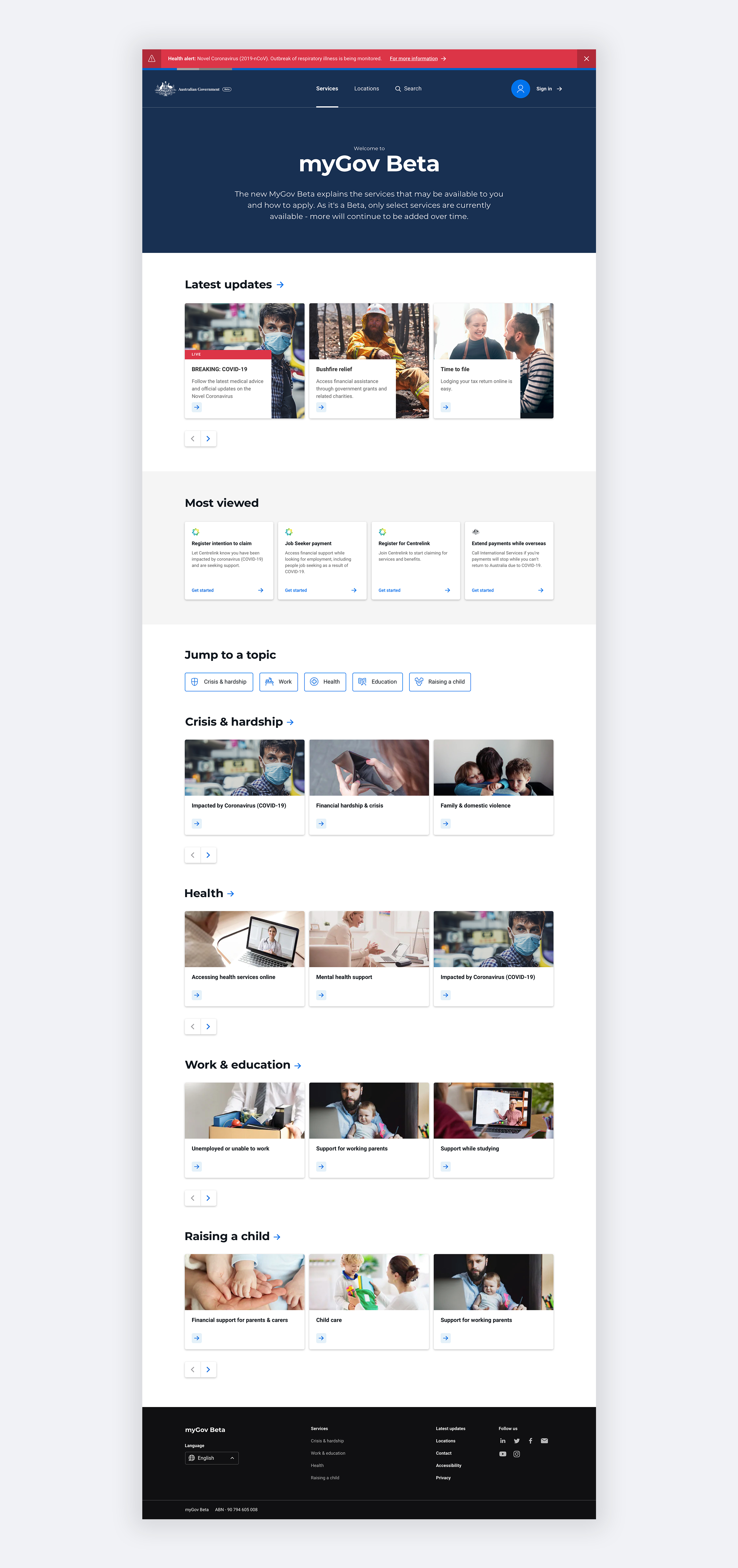
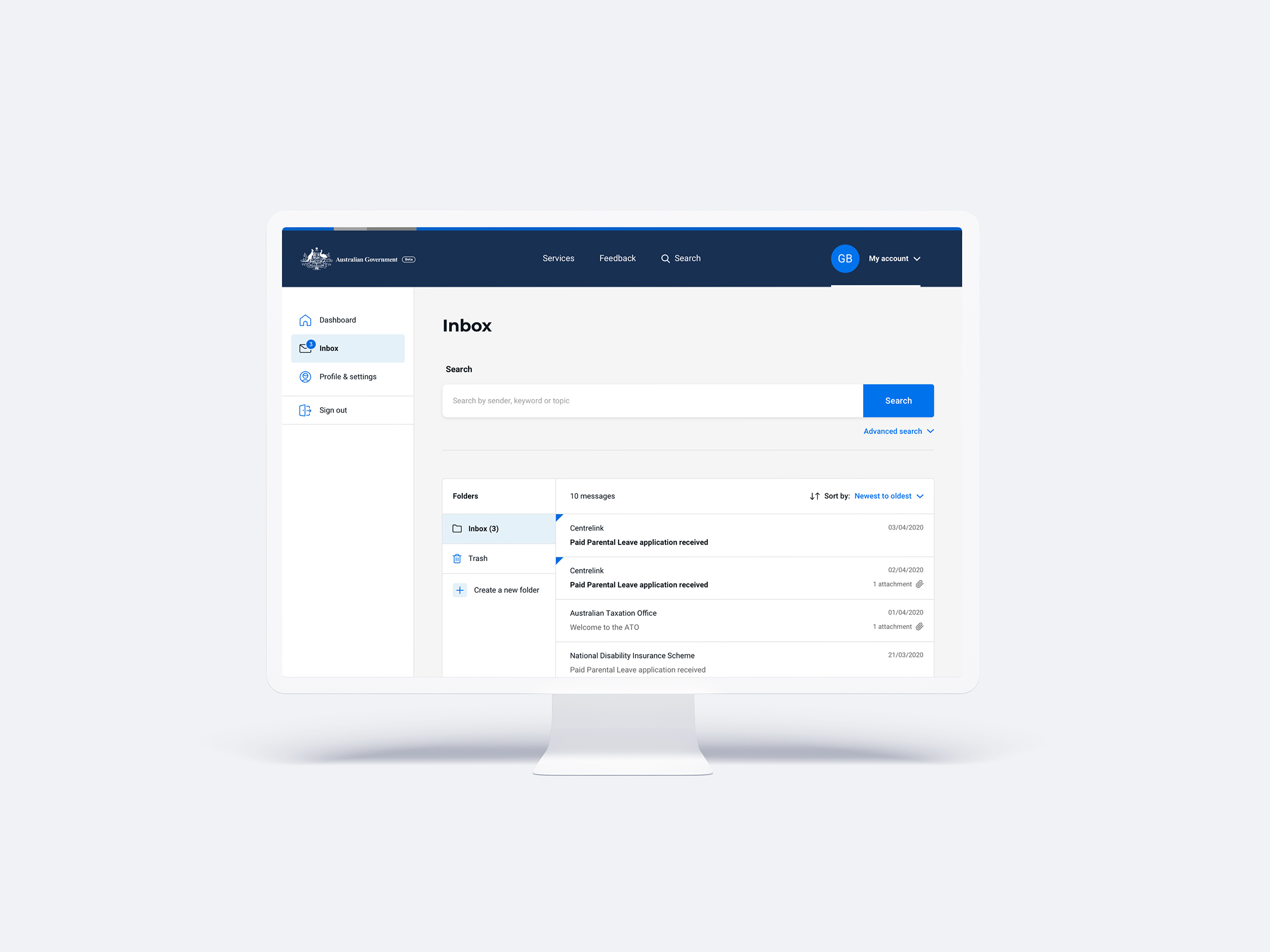
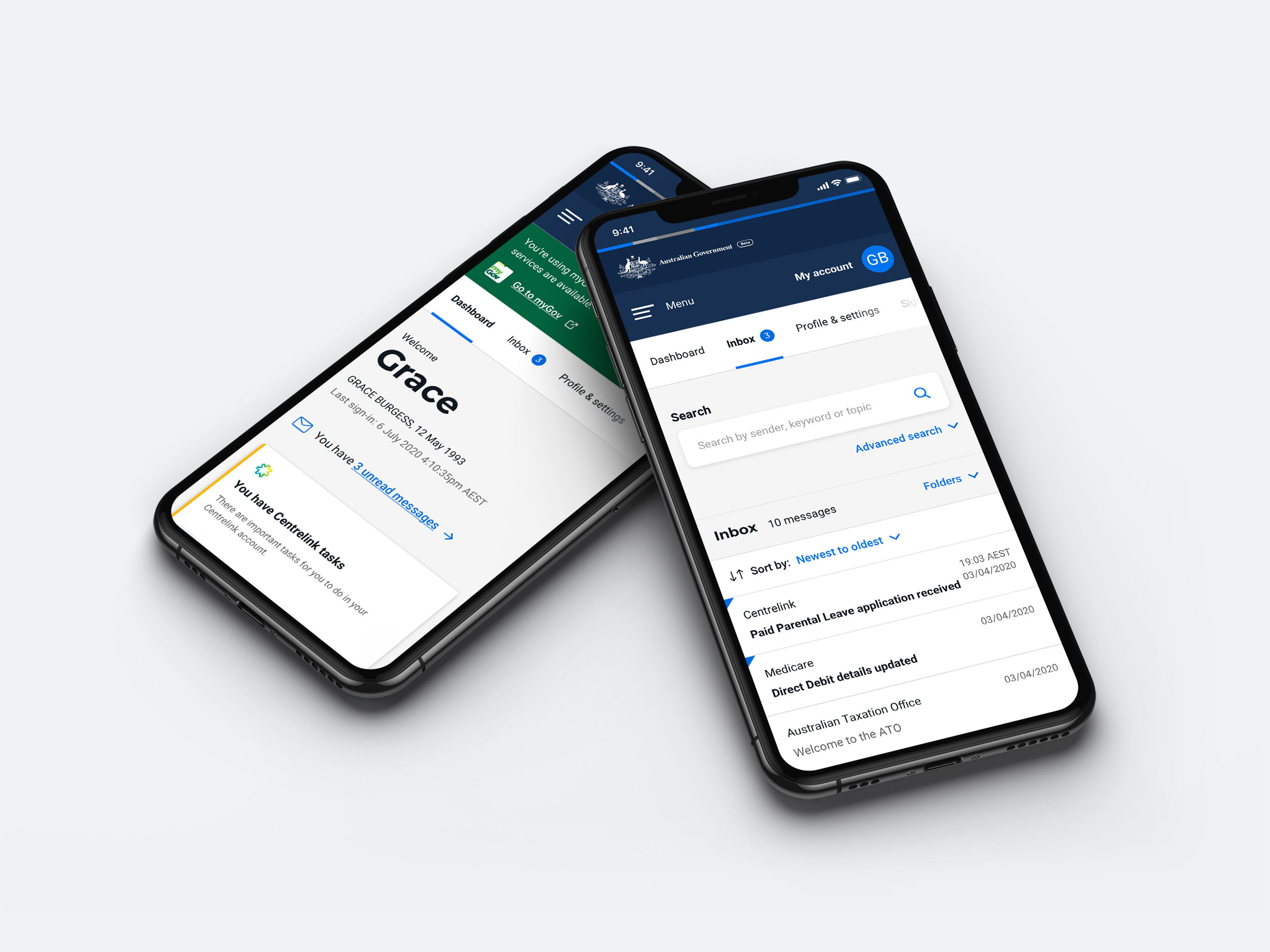
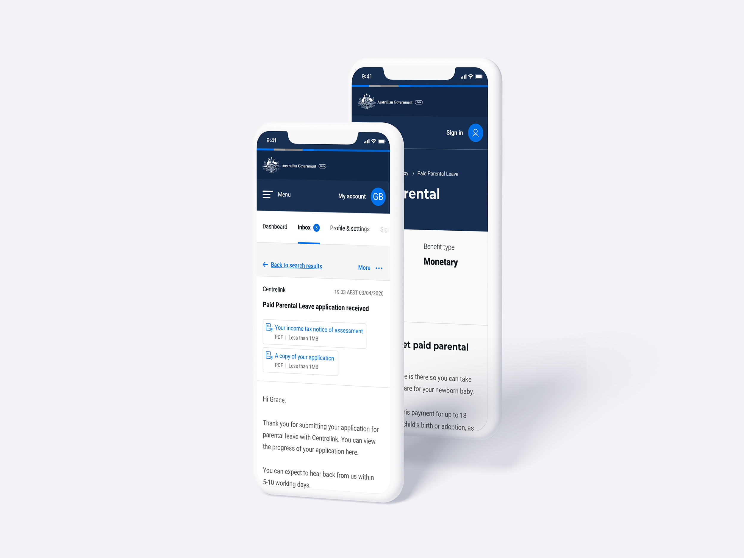
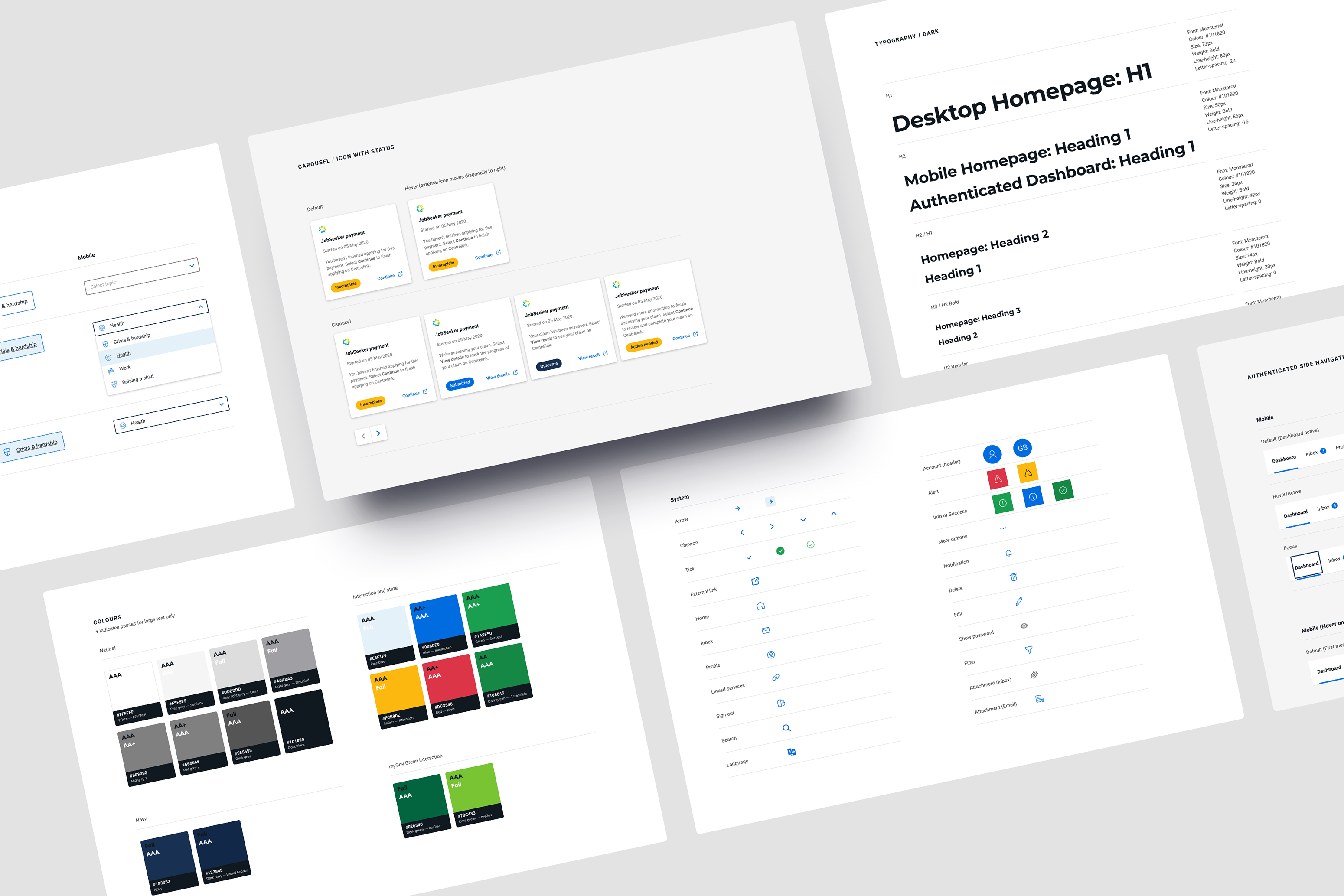
Together with the Digital Transformation Agency (DTA) and Services Australia, we designed the foundations for the future of myGov.
Challenge
Australians view the government as a single entity, however there are many separate agencies that make up the government. To create the future of myGov, we needed to uncomplicate the way people find, understand and access government payments. Content had to be structured in a user-centric way to support and empower Australians when interacting with the government.
This project started as a Proof of Concept (PoC) for myGov Beta, but when COVID-19 hit the project was rapidly turned into a 1-day deadline to update Australia.gov.au and pivoted myGov Beta's focus to provide access to services impacted by COVID-19. Our large team was entirely remote yet we had to collaborate in an agile fashion with many resources (BAs, FED, AEM, UX, VD) as well as our clients.
Approach
The project was set up as a phased approach, with three “horizons” to gradually roll out features, payments, content and onboard further government agencies. Across myGov Beta, we delivered over 70 features, 400 user stories and over 270 design variations at pace. Our releases focused on including services impacted by COVID-19, including delivering the Australia.gov.au website, as well as a refreshed authenticated myGov experience including a dashboard with an at-a-glance view of a citizen’s Centrelink payments, profile and myGov inbox.
From the beginning of the first delivery phase, immediately after the PoC phase, I was given the responsbility of owning and building out the 'Master' design system in Sketch to ensure quality and consistency amongst a large team of several UX and visual designers working at pace in 1-week sprints. The design system applied to both myGov Beta and Australia.gov.au. This design system was used as a source of truth and I was the clear owner responsible for updating and maintaining the Sketch library, and communicating changes back to the team. I set up each component to be as agile and responsive as needed, as well as documenting and organising them clearly to be uploaded to InVision for the entire project team to reference.
In addition to creating new page templates and components, I regularly reviewed designs from our visual designers, and was front and centre for build reviews as the key designer attending our daily 'Defect Traige' meetings, where I frequently talked to detailed design defects I'd raised on Jira to ensure a high-quality end product.
Result
MyGov Beta is a single place to view Government information, benefits and services that can be scaled to onboard future agencies. The new experience structures information around key life events where a user interacts with Government, surfacing clear and succinct details in a visual, card-style format based upon the 'Netflix model'. The authenticated site empowers Australians to self-manage their interactions with Government by providing a more personalised and guided experience with clear paths to action.
I was asked to document and upload 30 of the myGov Beta components into DTA's 'Community of Practice' forum which houses suggestions for new components in the DTA design system, and is used as a foundation across multiple government teams throughout Australia. This led to receiving very positive feedback about our design system from designers in QLD's Department of Health and the Department of Education, Skills and Employment. The QLD Department of Health team requested a Q&A walkthrough of our design team's processes and approach for the design system, and took inspiration for the design and build of their network of health sites.
