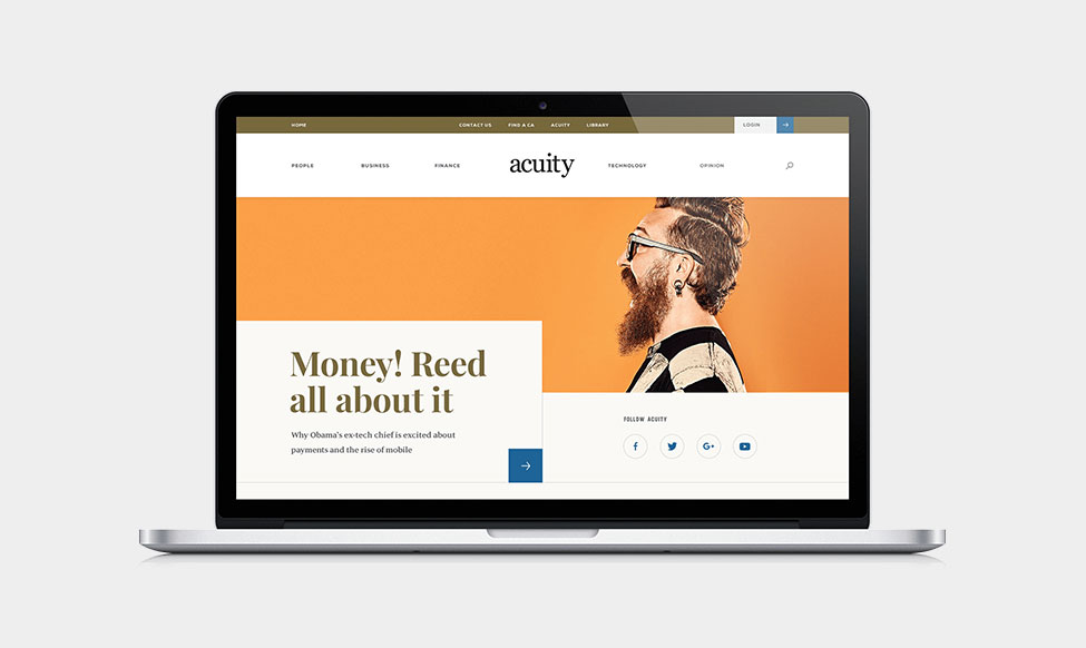
Chartered Accountants ANZ asked Deloitte Digital to design a website that would rid the stigma of the 'boring accountant stuck in the office'.
They wanted to be represented in the industry with a point of difference - contemporary and relevant yet timeless, and sophisticated yet editorially edgy. They wanted to tell a story.
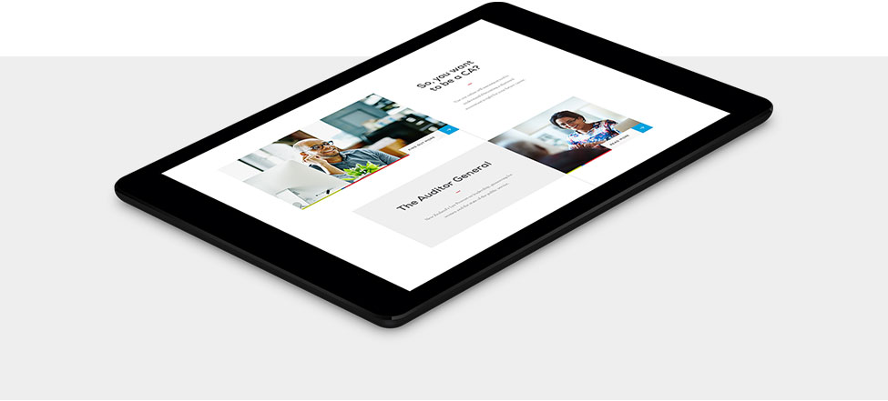
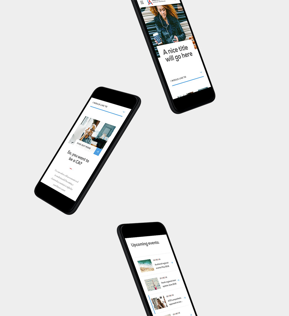
With the new design we created an editorial look and feel that feels significantly more modern and edgy yet pared back enough to still remain true to CA ANZ's brand.

CA ANZ's story is introduced by an authentic and natural video reel that plays at the top of the home page. The story continues with centred content anchored by a visual line which creates a point of focus for the user as they move down the page.
The website is more text heavy than image heavy, so we had to make sure there were other visual elements that would create interest. We included moments of surprise and delight, including the introductory video reel, a beautiful mega-menu that fills the screen, a large drop-down search bar, animated transitions for imagery and considered use of CA ANZ's logo variations and colour palette as graphic devices.

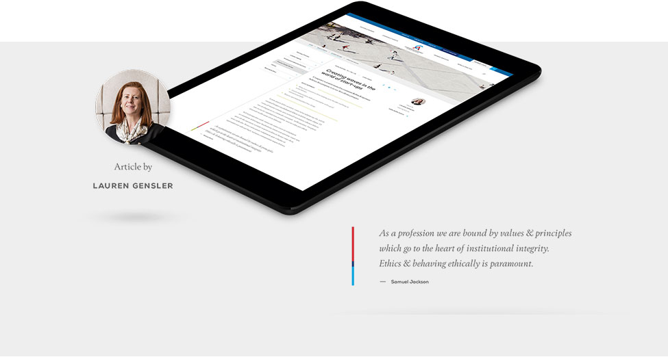


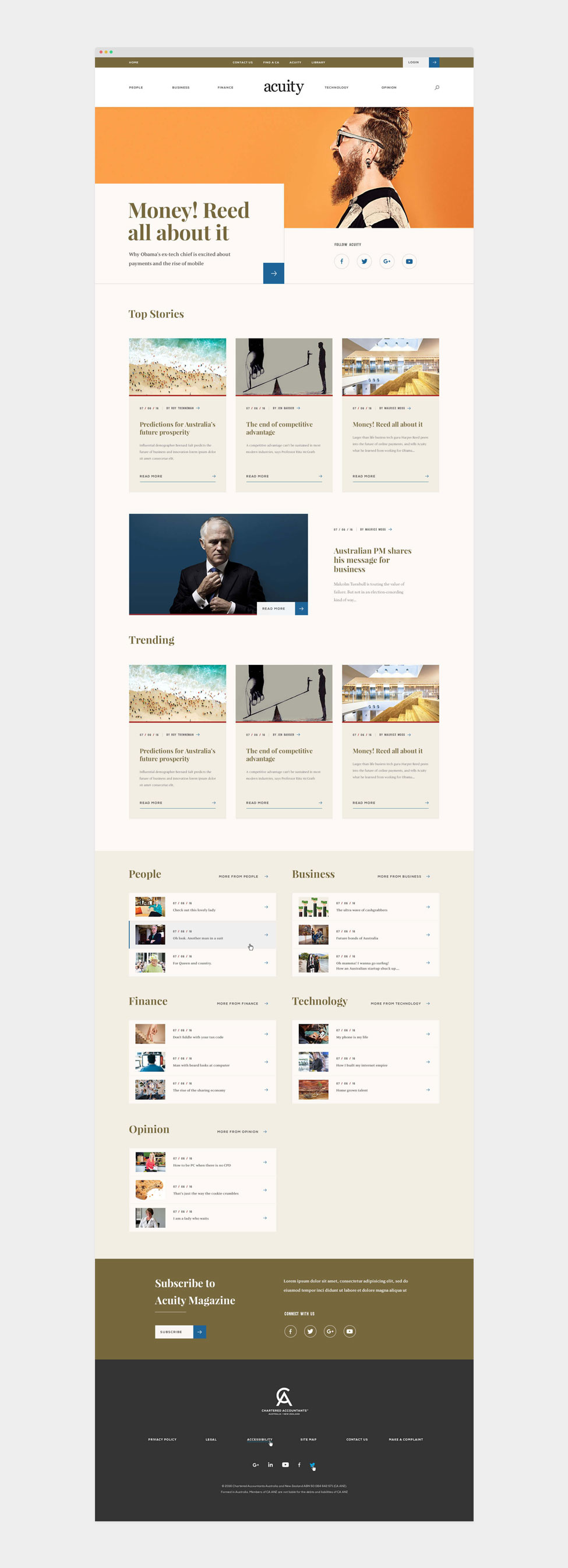
Chartered Accountants ANZ also asked Deloitte Digital to create a microsite for their print magazine, Acuity. We applied the Acuity branding and gave the home page its own distinct look and feel. Acuity was designed with a classic and luxe editorial aesthetic, while still maintaining the general layout of the CA ANZ website.
